Introduction
The Sweet Dreams branding project required a logo that appeals to a broad and diverse audience, including patients ranging from children to the elderly. The core focus of the brand is anaesthesia services, so the logo needed to reflect the key values of professionalism, safety, and comfort, while subtly referencing the art of anaesthesia.
The Sweet Dreams branding project required a logo that appeals to a broad and diverse audience, including patients ranging from children to the elderly. The core focus of the brand is anaesthesia services, so the logo needed to reflect the key values of professionalism, safety, and comfort, while subtly referencing the art of anaesthesia.
Understanding the Needs
The logo had to resonate with an audience as young as 12, but more importantly, communicate trust and comfort to adult patients, surgeons, and hospitals. The challenge was to create something professional and inviting, which hinted at the reassuring, pain-free experience that anaesthesia provides.
Concept Development
We began by exploring symbols that evoke safety and comfort while subtly linking to anaesthesia. During the process, I noticed that the lower part of the two ‘e’s in the word “Sweet” resembled closed, sleeping eyes. This observation inspired a design direction that would align perfectly with the idea of comfort and restful anaesthesia, which was key to the service.
The Solution
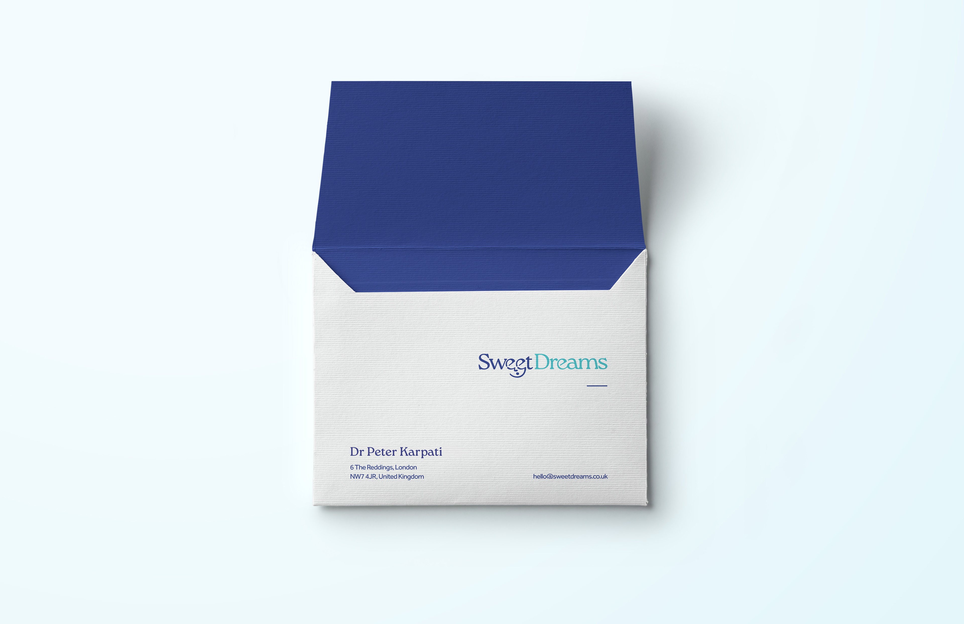
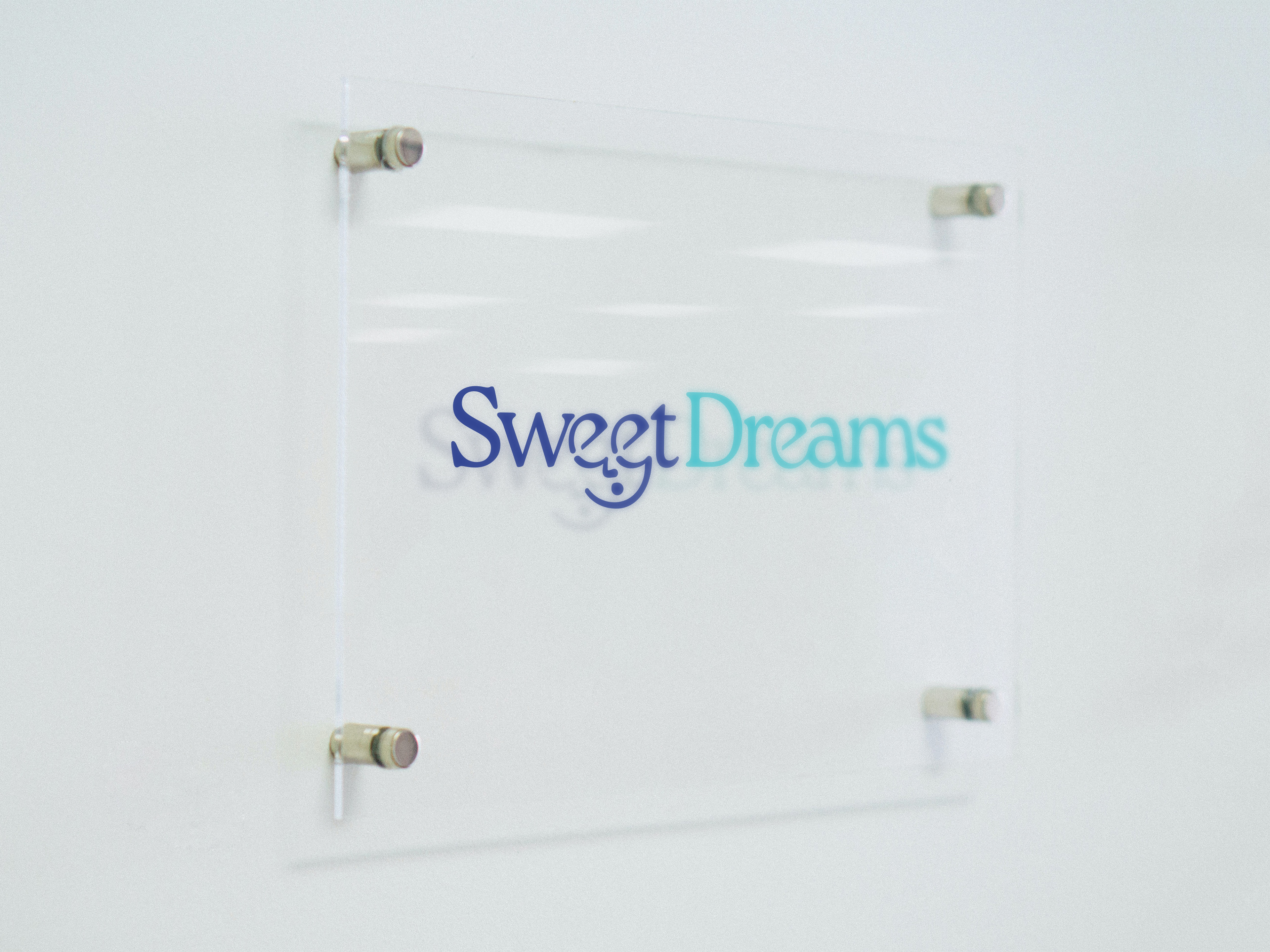
The final logo concept featured the word "Sweet" with the two ‘e’s styled as closed eyes, creating a subtle visual of a sleeping face. This design was simple yet clever, linking the brand to the concept of comfort, rest, and safety in anaesthesia. The sleeping face integrated seamlessly into the logotype, ensuring the brand’s professionalism remained intact while also making it approachable for a wide audience.
Problem Solving
The main challenge was balancing professionalism with comfort and care, ensuring the logo appealed to both medical professionals and patients. By incorporating the sleeping face into the typography, We achieved a design that visually communicated rest and reassurance, while keeping the look professional and suitable for a healthcare setting.
Conclusion
The Sweet Dreams logo successfully combines professionalism and comfort, making it a strong reflection of the anaesthesia services provided. The use of the two ‘e’s as sleeping eyes creates a clever and approachable visual, while still conveying the core values of safety and expertise. The logo is simple, memorable, and perfectly suited to a wide-ranging audience.


