Introduction
In today's competitive landscape, a strong and engaging visual identity is crucial for any organiSation, especially those catering to children and families. A day nursery, as a place that fosters early childhood development and growth, needs a brand that reflects warmth, playfulness, and trust. In this case study, we'll explore the process and impact of redesigning the visual identity for a day nursery. From the initial concept to the final execution, discover how friendly characters and colorfulL building blocks came together to create a joyful and inviting brand.
Understanding the Needs
The primary goal was to create a visual identity that resonates with
both children and their parents. The brand needed to be playful, fun, trustworthy, professional, versatile and memorable
both children and their parents. The brand needed to be playful, fun, trustworthy, professional, versatile and memorable
Concept Development
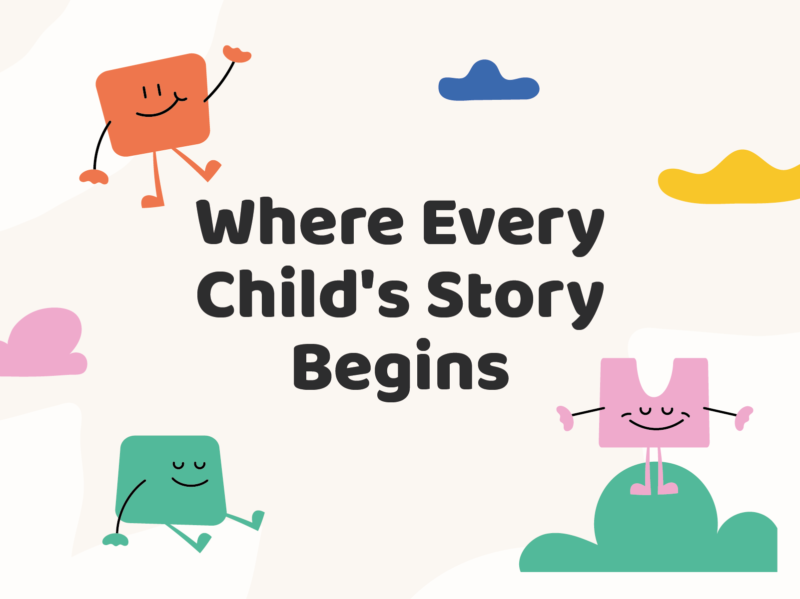
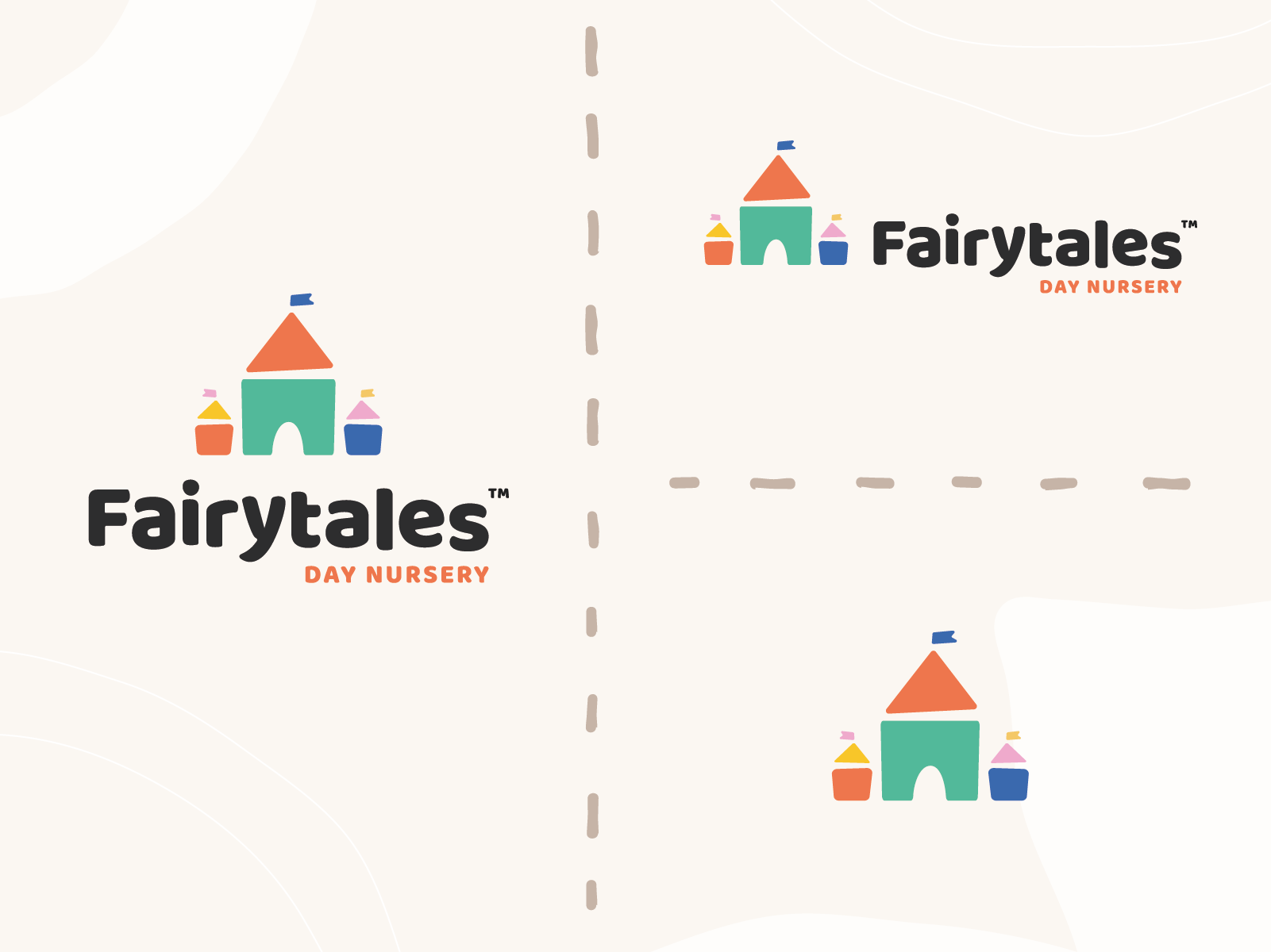
The concept revolved around using colourful building blocks as the core element of the logo. Building blocks are not only a universal symbol of childhood but also represent growth, creativity, and learning-key values for the day nursery. The idea was to further enhance this concept by incorporating friendly characters crafted from different bits of the logo, turning these elements into playful, joyful figures that would appeal to both children and adults.
The Solution
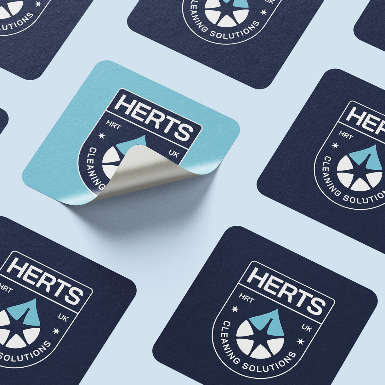
The new logo was designed using vibrant, cheerful colours and simple shapes, mimicking building blocks. Each block was carefully selected to convey a sense of joy and dynamism. The characters, derived from these blocks, were designed to be friendly and engaging, adding an extra layer of personality to the brand.
Problem Solving
One of the main challenges was creating a cohesive brand that could be easily recognized and applied across different touchpoints. The solution involved ensuring all elements of the visual identity worked harmoniously together, creating a unified look and feel, and designing elements that could be adapted for different uses without losing their impact or recognisability.
Engaging Children and Parents
The new identity needed to appeal to both the nursery’s young audience and their parents. This was achieved by crafting characters from the building blocks, adding a fun and playful dimension that children could relate to, while maintaining a balance between playful elements and a professional overall design to instil confidence in parents
Conclusion
By focusing on playful, friendly characters and colourful building blocks, I created a brand that not only appeals to children but also reassures parents of the quality and care their children will receive. The new identity has proven to be a valuable asset, enhancing engagement, increasing enrolment, and strengthening brand recognition.


