INTRODUCTION
Herts Cleaning Solutions has long been recognised for its exceptional cleaning services, backed by years of expertise and membership in the National Carpet Cleaning Association. Despite their strong reputation, the company’s branding lacked a visual identity that effectively communicated their professionalism, eco-friendliness, and commitment to quality.
THE IDEA
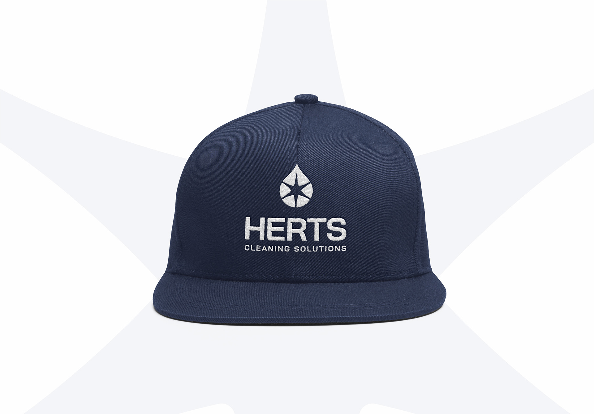
The redesign aimed to encapsulate Herts Cleaning Solutions’ core attributes: freshness, eco-friendliness, and professionalism. At the heart of the concept was a water drop, symbolising cleanliness and sustainability, paired with a star representing expertise, improvement, and customer satisfaction. The star split the water drop into five sections, each representing a key brand value: precision, excellence, integrity, improvement, and professionalism. This thoughtful integration ensured the logo embodied the company’s ethos.
THE SOLUTION
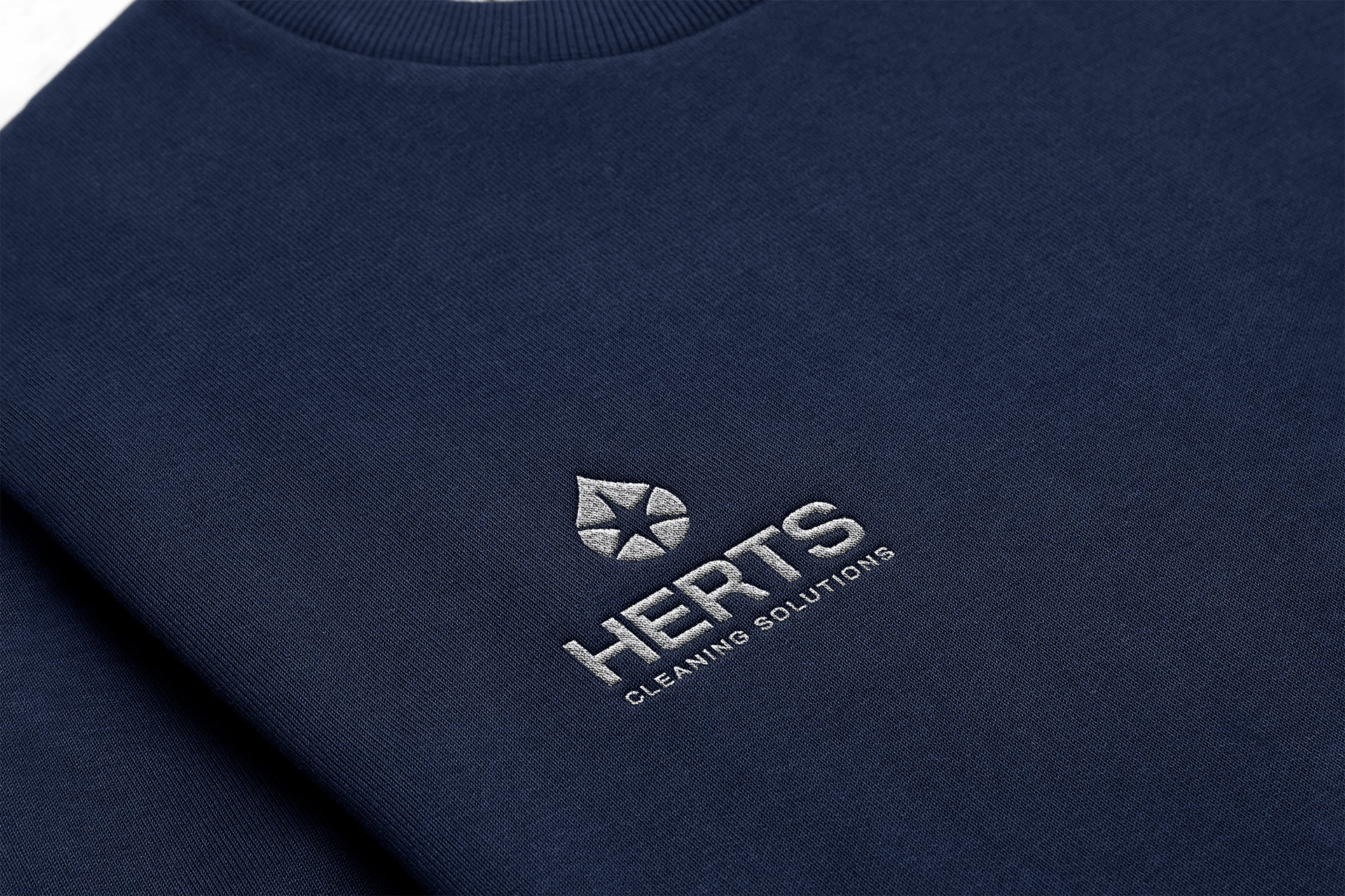
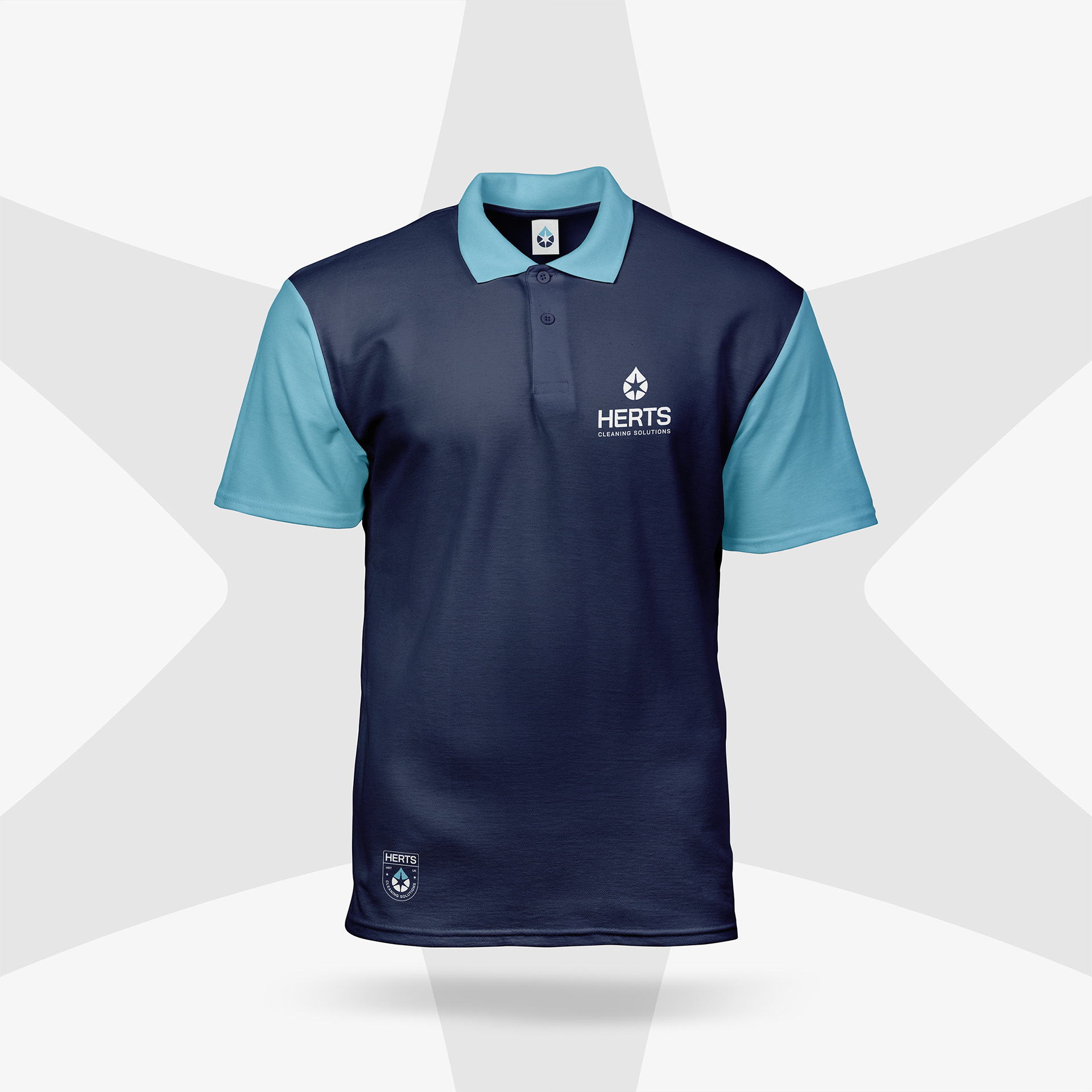
The final logo combined the water drop and star into a clean, modern design, capturing the essence of freshness and expertise. To ensure flexibility, three logo lockups were created: a primary logo for main applications, a secondary logo for simplified contexts, and a badge version for smaller uses like uniforms or social media.
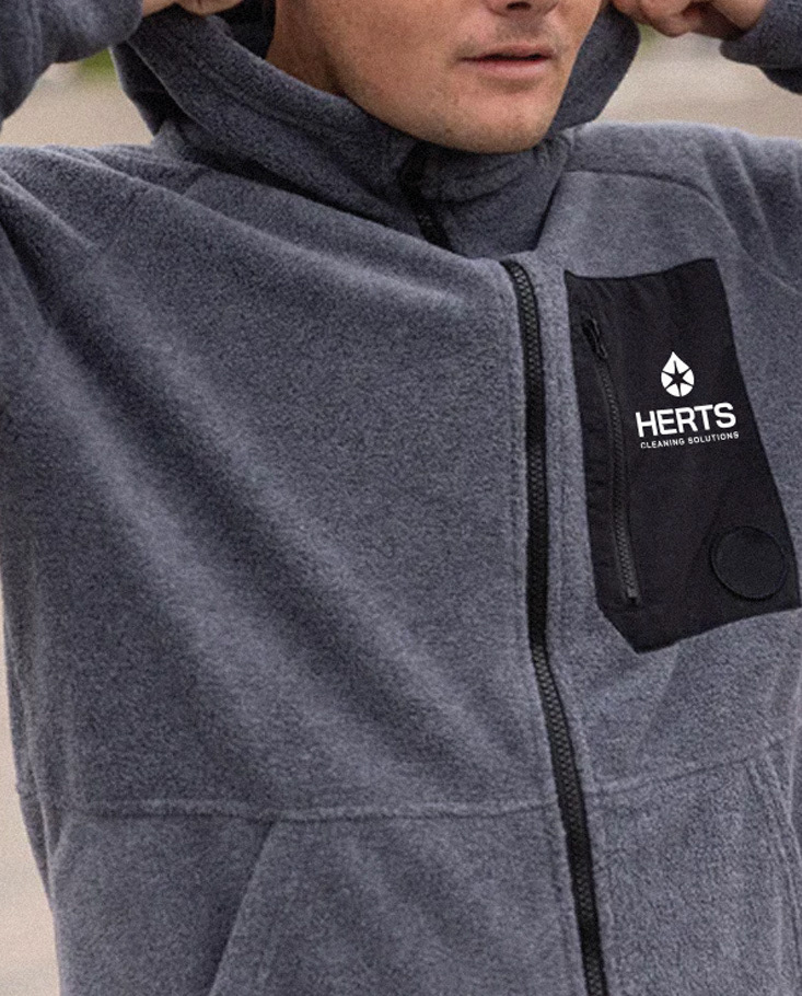
A cohesive visual identity system supported the logo, with a colour palette of clean blues and greens reflecting eco-friendliness and professionalism, and modern, legible typography reinforcing trust and approachability. This ensured the branding could maintain consistency across printed materials, digital platforms, and vehicle signage.
PROBLEM SOLVING
The challenge was to create a logo that conveyed diverse values while remaining visually simple and adaptable. The water drop symbolised cleanliness and eco-friendliness, while the star reflected improvement and expertise. By creating three logo variations, the branding offered the flexibility to suit different applications without losing its coherence. The clean design also enhanced the perception of professionalism, aligning with the company’s reputation for high-quality services.
IMPACT & RESULTS
The new identity successfully captured Herts Cleaning Solutions’ values and professionalism. Customers responded positively to the fresh, modern design, which strengthened trust and brand loyalty. The flexibility of the logo lockups ensured a consistent and recognisable presence across all platforms, helping the company stand out in a competitive market.
CONCLUSION
The redesigned identity for Herts Cleaning Solutions elevated the brand, aligning its visuals with its reputation for excellence. By combining the symbolic water drop with the professional star, the new branding conveyed quality, trust, and eco-consciousness. With its flexible, modern design, the company is well-positioned for continued success and growth.
WATCH INSTAGRAM REEL ABOUT THIS DESIGN
WATCH INSTAGRAM REEL ABOUT THIS DESIGN


